Selective Color: How to Make One Color Stand Out in a B&W Photo
July 23, 2025
The selective color effect is one of the most striking and recognizable techniques in photo editing. It involves converting an image to black and white while leaving one or more specific colors intact. The result is a dramatic, high-contrast image that immediately draws the viewer's eye to the colored element. You’ve likely seen it in movies (like the iconic red coat in *Schindler's List*), advertisements, and artistic photography. It’s a powerful way to highlight a subject, create a specific mood, and tell a visual story.
While it can be a dramatic and beautiful effect, it's also one that can easily be overused or look cliché if not done with intention. This guide will teach you how to create the selective color effect effectively and provide tips on when to use it for maximum impact.
Why Use the Selective Color Effect?
This technique is all about creating a focal point and emphasizing a narrative.
- Ultimate Focal Point: In a monochrome world, a splash of color is the most powerful visual magnet you can create. There is no ambiguity about where the viewer should look. This is perfect for drawing attention to a key product, a person in a crowd, or a specific detail in a scene.
- Mood and Symbolism: Color is deeply tied to emotion. Leaving a single color can infuse the entire image with the feeling associated with that color. A red object might symbolize love, passion, or danger. A blue object might feel calm or melancholic.
- Artistic Expression: It’s a fun, creative technique that can transform a standard photo into a stylized piece of art. It breaks from reality and shows a more interpretive view of a scene.
How to Create the Selective Color Effect
The professional method for this technique involves using layer masks, which gives you the most control. Here is a step-by-step guide to how it’s done in most modern photo editors.
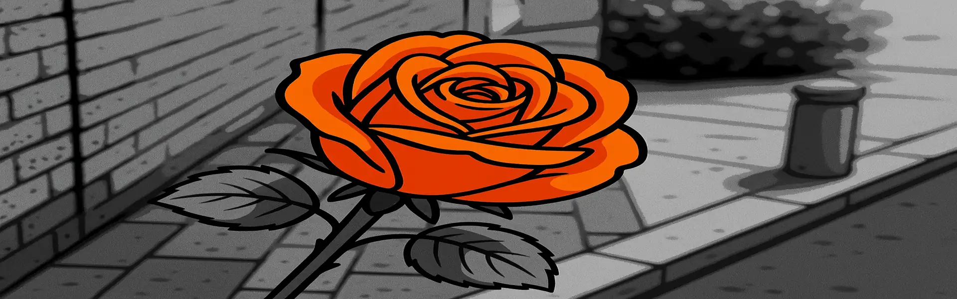
- Step 1: Choose the Right Photo. The best candidates for this effect have a strong, clearly defined subject with a distinct color that doesn't bleed too much into the rest of the image. A photo of a red rose against a green background is a better choice than a photo of a red car next to a red brick wall.
- Step 2: Create Two Layers. You will need two versions of your image stacked on top of each other. In your editor, create a duplicate layer of your photo. You should have:
- A top layer (this will become the black and white version).
- A bottom layer (this will remain in full color).
- Step 3: Desaturate the Top Layer. Select the top layer and convert it to black and white. For the best result, use a B&W mixer tool to control how the colors are converted to grey, which will give you a richer monochrome image to work with. At this point, your entire image will look black and white, as the top layer is completely obscuring the color layer below it.
- Step 4: Create a Layer Mask. This is the crucial step. Add a layer mask to your top (black and white) layer. A layer mask is like a stencil. By default, it will be white, meaning the entire black and white layer is visible.
- Step 5: Paint with Black to Reveal Color. Now, select the Brush tool and set its color to black. Make sure you are painting on the *mask*, not the image itself. As you paint over the area of the image where you want the color to show through (e.g., the yellow taxi), you are essentially "cutting a hole" in the black and white layer. This reveals the original, full-color layer that lies beneath.
- Step 6: Refine Your Mask. Zoom in and use a smaller brush to carefully paint around the edges of your subject. If you make a mistake and reveal too much color, simply switch your brush color to white and paint back over the area to restore the black and white effect. This ability to correct mistakes is why using a mask is the superior, non-destructive method.
- Step 7: Final Adjustments. Once you are happy with your selection, you can make final adjustments. You might want to increase the contrast of the black and white layer or boost the vibrance of the underlying color layer to make the effect even more dramatic.
Tips for Using Selective Color Effectively
- Less is More: The effect is most powerful when the colored object is relatively small and the rest of the scene is visually interesting in black and white.
- Tell a Story: Don't just use the effect because you can. Think about *why* you are highlighting that specific color. Does it add to the story or emotion of the photo?
- Be Precise: Take your time with the mask. A sloppy edge where color bleeds out of the lines will instantly make the effect look amateurish. Use a soft-edged brush for a more natural transition.
- Don't Overdo It: Because this is such a stylized and popular effect, it can sometimes feel dated or cliché. Use it thoughtfully and sparingly in your portfolio to ensure it retains its impact.
Conclusion
Selective color is a fantastic tool to have in your creative arsenal. It provides an unparalleled way to direct the viewer's focus and inject a powerful dose of mood and symbolism into an image. By using a layer-based workflow, you can create this stunning effect with precision and control, resulting in a clean, professional, and impactful piece of art that stands out from the crowd.