Editing 101: The Difference Between Saturation, Vibrance, and Hue
July 24, 2025
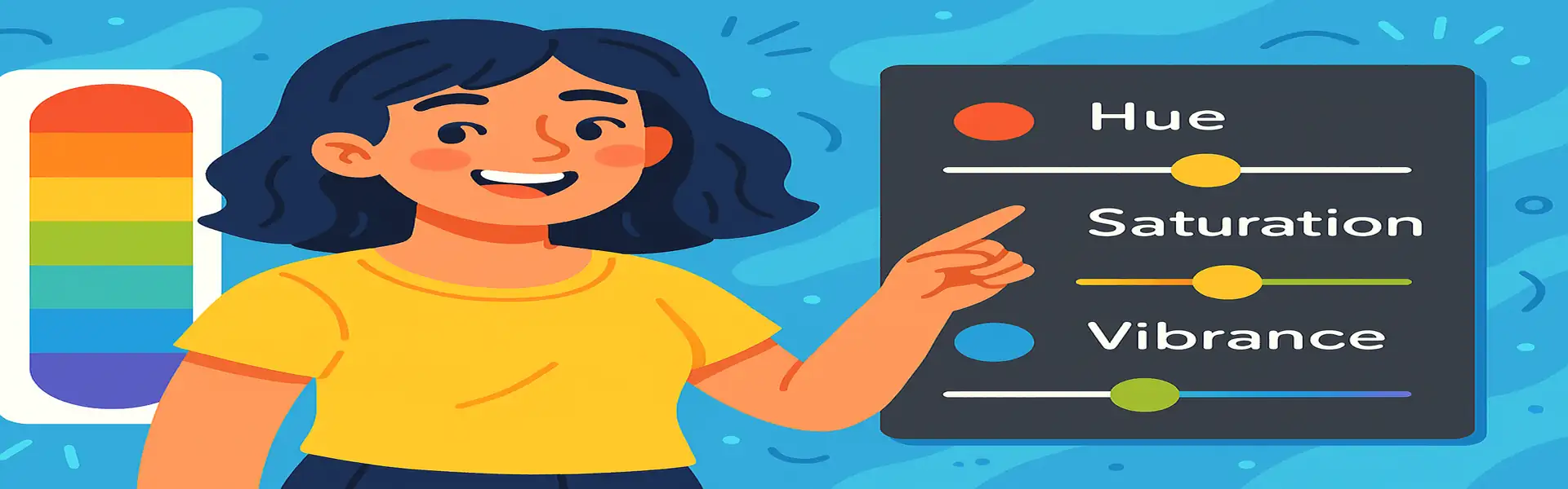
When you first venture into the world of color editing, you’re immediately confronted with a trio of sliders that seem to do similar things: Hue, Saturation, and Vibrance. It’s easy to think of them as generic "color" controls, but they each perform a very distinct and specific function. Pushing them around randomly can lead to unnatural, over-edited images. Understanding the precise role of each slider is fundamental to mastering color correction and enhancement.
This guide will break down the exact difference between these three core concepts. Learning to use them with intention will give you precise control over the colors in your photos, allowing you to create moods, fix problems, and enhance your images like a professional.
The Foundation: Understanding Color Properties
Every color you see on your screen can be described by three properties. This is often called the HSL color model:
- Hue: This is the property that gives a color its name. It’s what we mean when we say "red," "green," or "blue." Hue is represented as a degree on a 360° color wheel. Red is at 0°, green is at 120°, and blue is at 240°.
- Saturation: This refers to the intensity or purity of a color. A highly saturated color is rich and vivid. A color with zero saturation is a shade of grey (monochrome).
- Luminance (or Lightness/Brightness): This is the brightness of a color, ranging from black (0% luminance) to the pure color (50% luminance) to white (100% luminance).
The Hue, Saturation, and Vibrance sliders in your editor are designed to manipulate these properties.
Hue: Changing the Color Itself
The Hue slider is the most dramatic of the three. It fundamentally changes the colors in your image by shifting them around the color wheel.
- What it does: When you adjust the Hue slider, you are telling the software to replace each color with a different color. A small shift might turn a blue sky slightly cyan or purple. A large shift will completely remap all the colors, turning a green tree into a purple one, for example.
- When to use it: The global Hue slider is rarely used for corrective purposes, as it affects the entire image and usually produces very unnatural results. However, it’s a powerful creative tool for creating abstract art or surreal effects. Its real power comes in the **HSL Panel**, where you can adjust the hue of a *specific color range*. For example, if a green lawn looks too yellowish, you can select the yellow channel and shift its hue slightly towards green to fix it without affecting the other colors in the photo.
Saturation: The Blunt Instrument of Intensity
The Saturation slider controls the intensity of *every single color* in your image equally.
- What it does: When you increase saturation, all colors become more intense. When you decrease it to -100, all colors are removed, and you get a black and white image.
- Why it’s dangerous: Saturation is a blunt tool. It doesn’t discriminate. If you push it too far, it will oversaturate colors that are already vibrant, leading to ugly color clipping and unnatural skin tones. A portrait with too much saturation can make a person look like they have a bad sunburn. It’s the number one cause of amateur-looking edits.
- When to use it: Use it very sparingly. A tiny boost (+5 or +10) can sometimes be effective. It’s more often used to *reduce* saturation in a targeted area or on a specific color using the HSL panel.
Vibrance: The Intelligent Instrument of Intensity
Vibrance is a more modern and sophisticated version of the saturation control. It was invented specifically to overcome the problems of the standard saturation slider.
- What it does: Vibrance increases the intensity of colors, but it does so intelligently. It has two main characteristics:
- It has a much stronger effect on the most muted, least-saturated colors in the image.
- It has a much weaker effect on already-saturated colors, preventing them from becoming clipped and unnatural.
- The Secret Ingredient: Crucially, vibrance algorithms are designed to detect and protect skin tones. This means you can boost the vibrance in a portrait to make the colors in the background and clothing pop, without turning the person’s face an unflattering shade of orange.
- When to use it: **Almost always.** For global color enhancement, you should reach for the Vibrance slider first. It gives a more natural, pleasing result and is much more forgiving than the Saturation slider. It’s the professional’s choice for adding a tasteful pop of color to an image.
The Verdict: A Simple Workflow
Here’s how to apply this knowledge in practice:
- For general color enhancement, **always start with the Vibrance slider**. Push it up until you get a pleasing level of color intensity.
- If, after adjusting vibrance, the image *still* feels a bit dull, consider adding a **tiny, subtle boost with the Saturation slider** (+5 at most).
- If you have a specific color that is problematic (e.g., the grass is too blue), go to the **HSL panel** and adjust the **Hue** of just the green/blue channels.
Conclusion
While they all deal with color, Hue, Saturation, and Vibrance are fundamentally different tools for different jobs. Hue changes the color itself. Saturation is a powerful but indiscriminate sledgehammer for color intensity. Vibrance is a nuanced and intelligent paintbrush. By understanding these differences, you can move beyond clumsy, one-size-fits-all adjustments and start sculpting the color in your images with precision, intention, and skill.