A Beginner's Guide to Color Correction: Make Your Photos Pop
July 15, 2025
Have you ever taken a photo that looked vibrant and beautiful in person, only to find it looks flat, dull, or has a strange color cast when you view it on a screen? This is a common problem that even professional photographers face. The human eye is incredibly sophisticated and automatically adjusts for different lighting conditions, but a camera simply captures the light as it is. This is where color correction comes in.
Color correction is the process of adjusting the colors in a photo to make them look more natural, accurate, and vibrant. It’s one of the most impactful edits you can make, capable of transforming a mediocre snapshot into a stunning photograph. This guide will introduce you to the basic concepts of color correction and show you how to use simple tools to bring your images to life.
The Building Blocks of Color: Key Adjustments
You don't need to be a color scientist to correct your photos. You just need to understand a few fundamental sliders that are present in nearly every photo editing application, including online tools like Picu.
1. White Balance: Setting the Correct Temperature
White balance is the foundation of all color correction. Its job is to tell the photo what "true white" should look like. If the white balance is off, your entire photo will have an unnatural color cast. You'll typically see two main sliders:
- Temperature: This slider adjusts the color balance between blue and yellow. If your photo was taken indoors under tungsten light and looks too orange, you would slide the temperature towards the blue end to cool it down. If it was taken in the shade and looks too blue, you would slide it towards the yellow end to warm it up.
- Tint: This slider adjusts the balance between green and magenta. It's used less often but is crucial for correcting color casts from fluorescent lights, which can often give photos a greenish tint.
How to Use It: Find something in your photo that is supposed to be a neutral color (white, grey, or black). Adjust the Temperature and Tint sliders until that object looks truly neutral, without any color cast. Once you do that, all the other colors in the photo will typically fall into place.
2. Exposure, Contrast, Highlights, and Shadows
These sliders control the tonal range—the brightness and darkness—of your image. They are essential for adding depth and punch.
- Exposure: This is the master brightness control for the entire image. If the whole photo is too dark or too bright, start here.
- Contrast: This is the difference between the light and dark areas of your photo. Increasing contrast makes the darks darker and the lights lighter, adding "pop" to the image. Decreasing it can create a flatter, more muted look.
- Highlights: This slider specifically targets the brightest parts of your image. If the sky in your photo is too bright and looks like a white blob, you can pull down the highlights to recover the blue color and cloud detail.
- Shadows: This is the opposite of highlights. It specifically targets the darkest parts of your image. If a person's face is lost in shadow, you can push up the shadows slider to reveal their features without making the rest of the image too bright.
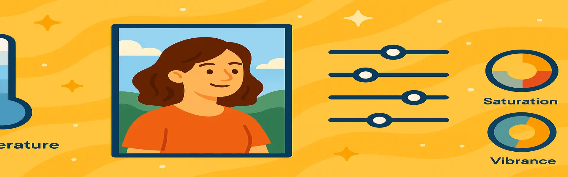
3. Saturation and Vibrance: Controlling the Intensity
Once your white balance and tonal range are set, you can adjust the intensity of the colors themselves.
- Saturation: This slider uniformly increases the intensity of every single color in your image. Be very careful with this one! Pushing it too far is a classic beginner mistake that leads to unnatural, radioactive-looking colors and blotchy skin tones.
- Vibrance: This is a "smarter" version of saturation. It primarily increases the intensity of the most muted colors in your image while leaving already-saturated colors alone. It's also better at protecting skin tones from looking unnatural. **When in doubt, use Vibrance instead of Saturation.**
A Simple Workflow for Color Correction
- Step 1: Fix the White Balance. Get your neutral colors right first. This is the most important step.
- Step 2: Adjust Exposure and Contrast. Set the overall brightness and add some initial punch.
- Step 3: Refine with Highlights and Shadows. Recover any lost detail in the brightest and darkest areas.
- Step 4: Boost Colors with Vibrance. Add the final touch of color intensity without overdoing it. Use saturation sparingly, if at all.
Conclusion
Color correction is an art, but it's grounded in a few simple, technical principles. By following a consistent workflow and understanding what each slider does, you can move beyond basic filters and take full creative control of your images. You can rescue photos you thought were unusable and enhance your best shots to make them truly unforgettable. The key is to make small, incremental adjustments and to always keep the goal in mind: to create a photo that looks natural, vibrant, and true to your vision.
Ready to bring your photos to life? Explore our free photo enhancement tools today!